Người đăng: Unknown on Thứ Hai, 30 tháng 7, 2007


Number 167


Sex and Skeletons Part 2


Dem bones. Dem bones. Dem dry bones. Or how 'bout dem living dry bones! Yow!

Of course we all know that skeletons aren't out walking around; we all know that when the tissue finally decomposes and there's nothing to hold it together, a skeleton is nothing more than a collection of loose bones. We all know that these horror comics covers with their living skeletons are just symbolic. But still, ulp. We'd all have a jolly time if one of these horrors suddenly popped up in front of us, wouldn't we?

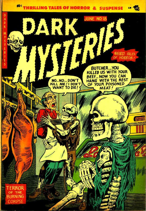
These covers have to do with revenge, a major theme for horror comics of the early 1950s. Here's a butcher who regrets meating a couple of bony guys, displeased by the shop's customer service.


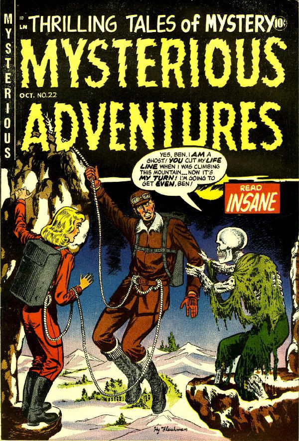
Here's another, by artist Hy Fleishman, of a skeleton getting his revenge on a mountain climber. (The climber whose sleeve is being held seems much too passive for someone confronted with such a sight.)


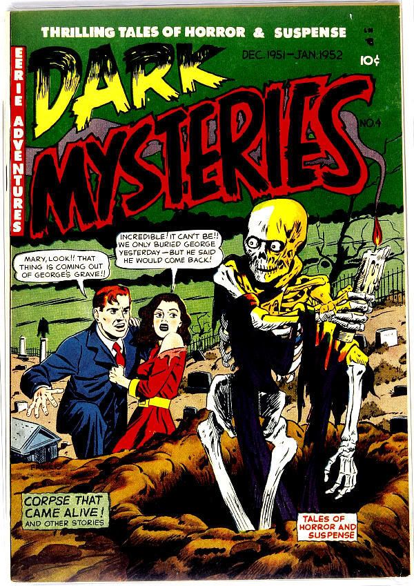
Another couple of covers have to do with revenge from a murdered spouse. In those cases the publishers got themselves into a tricky spot. First of all, the covers have a sub-theme of adultery. So not only did the enemies of comics get to see gruesomely awful covers, but they could take in that the couple being visited by the skeleton were probably having sex and killed the spouse to get him out of the way. Next to those the butcher and mountain climber covers seem relatively tame.
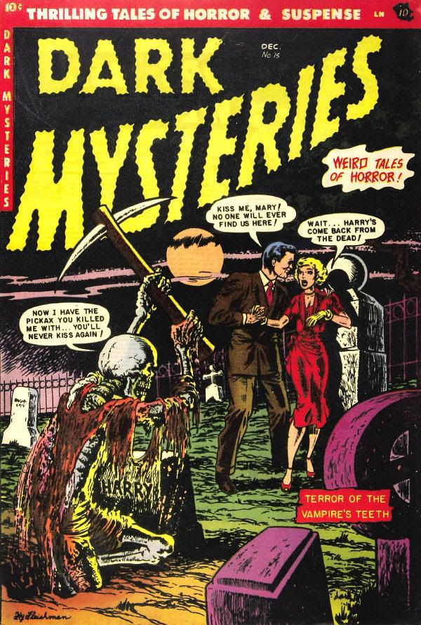


The husband on the cover of Dark Mysteries #4 seems pretty well decomposed for a guy just buried yesterday, doesn't he?


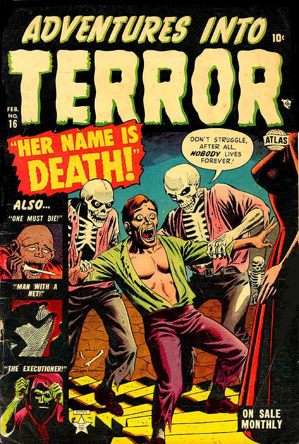
Here's a fella who's being presented to a woman, but not for a formal introduction, we surmise. We don’t know what he's done to deserve this treatment but it's gotta be bad. We don't see her head but we get to see some boobs. Another great Russ Heath horror comics cover. His skeletons look very scary. Considering what's got this poor chump, she must really be something for his mouth to be gaping so wide.

More about

Người đăng: Unknown on Thứ Bảy, 28 tháng 7, 2007


Number 166


Spectro Analysis


Spectro was yet another comic book magician, along the lines of Zatara, or the granddaddy of comic magicians, Mandrake. It seems every anthology comic book had to have at least one magician to go along with the stock parade of secret agents, private detectives, and of course, the resident super-hero.

In this story the only power I can detect for Spectro is an ability to read minds, and apparently, according to this story, not always able to do even that. Unlike Zatara, who chanted words backwards and created real magic, or Mandrake, who gestured hypnotically and created perceived magic, Spectro uses his fists. He is also missing the ever-present top hat of the comic book magician, but he wouldn't be able to show off his blond hair. Or it'd be knocked off when he socked a bad guy. He has one element of a costume, a red cape which he inexplicably wears off-stage. But then, comics magicians always dressed like they were ready for a performance.

The villain is a bespectacled teacher who turns out to be a conman. You can tell he's a teacher because his name is Mister Pedant. You can tell his gang are crooks because they talk like comic book criminals. You can tell this teacher isn't very smart because he acts like a comic book villain. He tries to kill the hero using a gimmick, and gives the hero the opportunity to escape. You can tell this story doesn't make a lot of sense, but then it's a filler in an otherwise average comic book, Wonder Comics #16 from 1948.

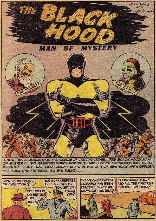
The artwork is by Al Camy (a/k/a Al Cammarata), who did three stories in this issue. According to what I see about Al Camy in the Grand Comics Database, he was active in the comic book field in the late 1930s, throughout the 1940s, and sometime into the early 1950s. He worked mostly for Richard E. Hughes at Nedor/Better, which became The American Comics Group. Earlier on he worked a lot for MLJ Comics, drawing such strips as the origin of The Black Hood from Top-Notch Comics #9. Here's the splash for that story:


Camy's solid artwork is that of a journeyman comic book artist. Not flashy, but it tells the story.

Also, checking again with the Grand Comics Database, this is the last Spectro story I see listed, so perhaps that silver dart Spectro pulled out of his shoulder had a slow-acting poison and after the last panel poor Spectro shuffled off to comic book magician heaven .


More about

Người đăng: Unknown on Thứ Sáu, 27 tháng 7, 2007

Number 165


Sex and Skeletons Part 1


Publishers have known since printing was invented that what attracts readers are images of sex and death. Horror comics of the 1950s were continuing a rich tradition. They had a lot of precedents to guide them, and by the middle of the 20th Century several of the comic book publishers had been involved in publishing pulp magazines--no strangers to sex and death--and some were even concurrently involved in publishing paperback books with lurid covers.

The cliché says you can't judge a book by its cover, but in reality you sell one by the cover.

I've picked out some of my favorite horror comics from the '50s, culled from places on the Internet, eBay, etc., even some from my own collection. All of these have something in common: they all show skeletons, since time immemorial the most common symbol of death, and an image that evokes a lot of reactions and curiosity. And speaking of curiosity, young kids looking over the comic covers in the '50s couldn't pass up the opportunity to ogle a sexy babe. Comics used the old damsel-in-distress motif a lot. They used bondage a lot and they used red dresses a lot, too. Not only were the red dresses eye-catching on the newsstand, they were also a symbol of a hot chick. They meant bad girl, a symbol for a prostitute, or at the very least, someone willing to have sex.

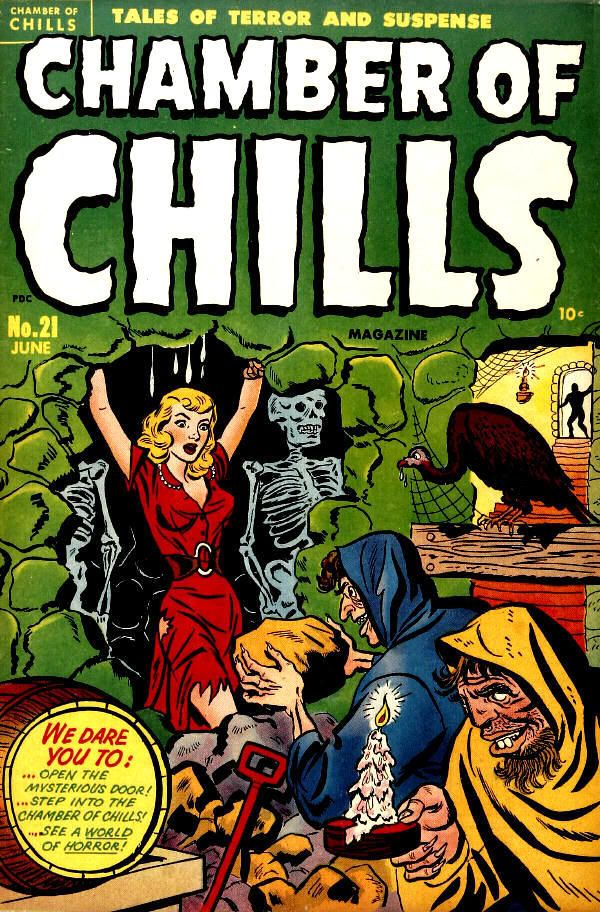
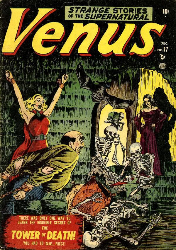
The covers also fell into sub-categories, looking for inspiration from other covers. Comic book publishers, or at least the artists, were looking to other artists and covers for inspiration; they swiped both ideas and artwork. Here are two sub-themes I've noticed while looking at my computer file of images. The Bill Everett cover of Atlas' Venus #17, dated December, 1951, appears to have been at least partially inspired by the cover of Chamber Of Chills #21 (actually, the first issue) by Harvey Comics' workhorse Al Avison, cover dated June, 1951.


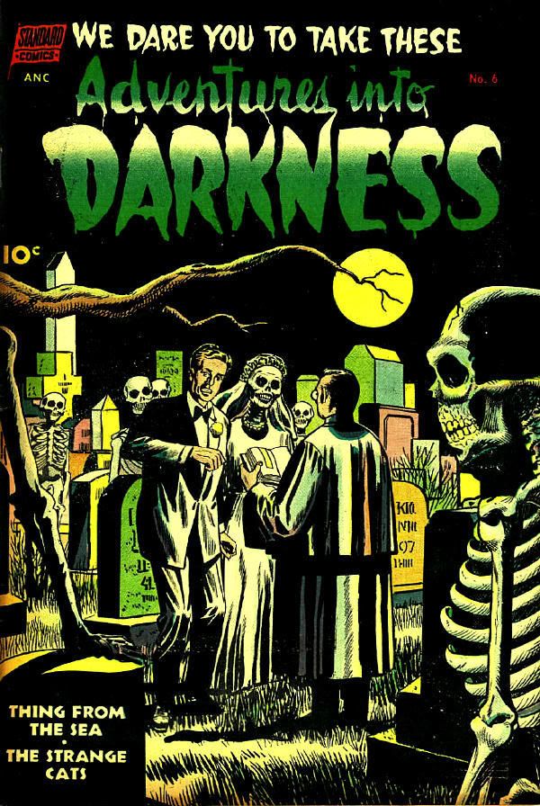
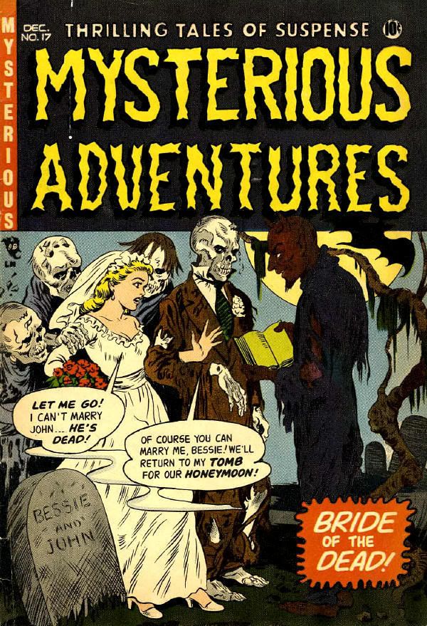
I've found three covers of skeletons being married to "normal" folks. Adventures Into Darkness #6, is the earliest, from 1952, also the one to show a guy marrying a skeleton girl. In this case I'd say his bride went to some extremes to lose weight so her dress would fit! Journey Into Mystery #6 and Mysterious Adventures #17, both from 1953, reverse that, with a girl marrying a skeleton. These gals picked some real stiffs to drag to the altar! Since Pappy's is a high-class blog we'd never make a joke about these covers reminding us of wedding night boners. We could, but of course we won't.


More about

Người đăng: Unknown on Thứ Tư, 25 tháng 7, 2007


Number 164


Space Ace Gets Woody!


This is the last Space Ace story from Jet Comics #4, the final issue.

Not only the last Space Ace, but because of the artwork it's the best of the series. Wally Wood inked over Al Williamson's pencils. What a combination they made. I wish they'd done a lot more work together. Wood's bold inking replacing Williamson's tentative inking of this period really makes a difference in how dynamic the story looks.

As for the story itself, well, it's Space Ace, after all…ace criminal of the spaceways, blah blah blah…gets into a jam over a woman, then gets himself out, blah blah…meantime getting lots of reward money or some jewelry or something good, blah blah…and then gets a full pardon for all his crimes, et cetera, et cetera...nice life!

As usual, some of the most entertaining bits of business are the little things that scripter Gardner Fox was good at: his pseudoscientific-sounding creations, like Ace's electric space pants (!!!) Wouldn't they give you a shock if you had to — you know — go to the bathroom? Not only that, he has the ability to turn them into a key to unlock a cell door. Or how about the paralysi-ray? Or Space Ace finding big tanks of nitrous oxide — laughing gas— so conveniently? Or how about describing Ace's fighting ability as being like a "Plutonian tigercat"?

I'm not an expert on all Golden Age comics (duh), so I just found out that ME published a Space Ace comic in 1952. I was also surprised to find out that Space Ace appeared in ME's Manhunt as far back as 1947. Well, hit me with a paralysi-ray! There's always something new to learn in this crazy comic book business.

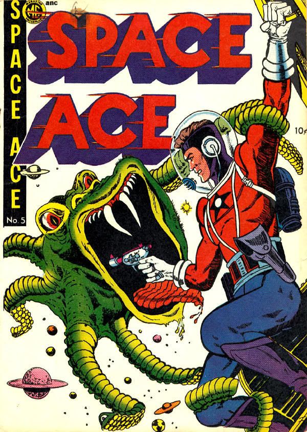
I found this cover on the Internet:


More about

Người đăng: Unknown on Chủ Nhật, 22 tháng 7, 2007


Number 163


Kink From Under The Counter


It's hard for me to believe, grizzled and jaded as I am today, that I was ever young and naïve. But I was. It was 1965, I was 18. A friend and I went into a bookstore. In some pre-arranged buy, my friend gave the clerk $3.00, which got him a digest-sized booklet, very slim. It was a black-and-white comic book called The Passion Pit.

The booklet was by Eneg, an artist I'd never heard of. Eneg was the pseudonym for Gene Bilbrew, an African-American comic book artist who turned to fetish illustrating and became well-known in that subterranean community. Bilbrew was born in 1923 and died in 1974 at the young age of 51. You can google his name and come up with several sites, some of them selling his printed work.

If this were published today it would be considered tame. There just isn't that forbidden thrill to spike-heeled boots, masks, whips and chains, or rubber clothes, not anymore. The mainstream co-opted those images some years ago. I saw a lot of them when I watched MTV with my son in the early 1990s and the heavy metal bands were thrashing around with models right out of Irving Klaw's shop in New York City.

A note on the copy I used for the scans: I found a pirate copy of The Passion Pit back in the late 1970s. It was called Chinese Torture, and Eneg's name was removed. The printing was not that good, photographed as it was from an original printed copy. Mine is a second generation from that generation. So if there are details that are muddy I apologize. Some of it isn't my fault. Some of the original printing flaws due to Bilbrew's sloppy original art are still present: There are lettering guide lines visible in some panels, even some pencil marks under his drawings. He also didn't rule his panel borders very straight. Personally, I like that sort of thing. It reminds me that a real live human being sat down at a drawing board and made these pictures, and was a sloppy workman with some of it. Just like the rest of us are at times in our everyday work.

I also get a kick out of his spelling: "Bhudda" and "strenght" show no editor was involved in this comic.


More about