 1. A Blogger Posts A Warning To His Readers
I do feel that I ought to warn anybody who's found it in their heart to persevere with these pieces on John Forte's Legion Of Superheroes that they'll find me writing below of how I've become convinced that Mr Forte would have been the perfect artist for Grant Morrison's "Final Crisis".
It strikes me that that's such an apparently ridiculous idea, and one which I'd certainly never have considered before writing these past few pieces, that I may have quite lost whatever sense of perspective I previously owned. (It's obviously gone wherever Mr Forte's sense of perspective had travelled before it.) Be warned, gentle reader, this may the case of the bridge too far beyond the bridge too far.
 And now; concluding our look at some of the strangeness-causing elements of Mr Forte's work;
II. Like some strange translation of the principles of Krautrock to the comic book page, John Forte's work gains much of its strange power through providing subtle variations within a framework of metronomic repetition. The same page layouts occur time after time, and unlike, for example, the periodic experiments that Curt Swan carried out with, for example, long vertical frames occupying two-thirds of a pages' left hand side while horizontal panels are stacked to the right, Mr Forte kept to a default page design of three equal rows containing two panels each. Four or five times over the length of a leading feature, Mr Forte would break this pattern by creating a single horizontal panel occupying an entire row, and as I've argued before, these longer, narrow pieces often contain his very best work. The effect is, over a run of pages, quite hypnotic, accentuated by his preference for front-facing wide to mid-shots and his reluctance to allow any figure to dominate the scene he's depicting. If the purpose of Jack Kirby's work was always to involve the reader by engaging their attention at the most intense moment of the action at hand, then Mr Forte's work was concerned with the opposite process. As can be seen by the panel below, the reader was far less thrown into the events on display so much as forced to view them through an observing character's eyes, placing us in the position of watching a character watching another character doing something.
 Here, Brainaic 5 engages in a dual of multi-dimensional chess while - I believe - Pete Ross and Jimmy Olsen ignore their different decades of origin to look on. As a result, we're not vigorously engaged with Brainaic 5, who's hardly locked into the most visually thrilling dual in the first place, but rather focused on the two teenagers watching him. This has the effect of pushing the reader out of the action, making us feel as if we're far away from events, as if we're wearing our distance lenses rather than having our glasses for close reading at hand. Combined with those other factors we've already discussed, from his own unique rule of "thirds" to the extremely strange perspective to the "backwards" direction of the action, it's as if Mr Forte has quietly dosed us with a selection of visual tranquillisers to prevent us becoming too excited. And yet, as with most mild dose of tranquillisers, there's that unexpected focus, that illusionary sense of precision of thought. By distancing the reader from the meaning of the panel, Mr Forte manages to lend his work an absurd kind of intensity. It's ridiculous, but it's also true.
 III. Though he does on occasion execute a comparatively daring mid-shot, or even a rare and almost perversely dynamic medium close shot with an attention-dominating figure in the foreground, such as shown above, Mr Forte is most comfortable stringing his characters across his panels in more or less straight lines while allowing no single figure to entirely dominate the attention. This again stands in direct opposition to Jack Kirby's work, because the refusal to centre on one figure or one example of action tends to diffuse the impact of whatever the panel is supposed to be depicting, creating multiple focuses vying for the reader's attention. This diffusion might have been avoided if, for example, Mr Forte had placed elements of vertical integration in the background of his work, strong organising top-to-bottom elements which might dominate the sense of his frames and pin his characters together in the same scene, with a common relationship to each other. Instead, characters seem to a degree to occupy quite separate and disconnected places, and even planes. Every character carries a similar weight of importance to every other one, and combined with a tendency to show full-body shots of figures dominated by the environment they're in, this gives the impression that nothing of real dramatic importance is happening here - even when the likes of flames are shooting out of Sun Boy's hands - and that we ought to move on. It's such an odd effect to create, especially when it is considered that Mr Forte obviously felt it was incumbent upon him to show most if not all of the Legion showing off their powers if just one or two of them needed to do so. (In such a way can his direct line to a child's mind be established. It's so easy to imagine a child describing the events occurring within individual panels of Mr Forte's LSH work: "And then Bouncing Boy was bouncing, and Sun Boy's hands were on fire, and Shrinking Violet was shrinking, and Chameleon Boy was changing shape .... ") This strange lack of focus can be seen in the shot of the Legion Of Substitute Heroes at the top of this page, and below, in what was actually one of Mr Forte's more dramatic panels, where each Legionnaire has their moment in the sun while Bouncing Boy flies all over the place in what seems like a deliberate attempt to prevent the eye coming to rest anywhere in the scene at all;
However, being as pleasantly literal-minded as he was, Mr Forte obviously felt compelled to give Colossal Boy far more panel-space than any other character when Gim Allen had grown into his giant-sized form. It was as if Mr Forte's habits of drawing a particular kind of landscape and placing his characters into it in a particular way couldn't be changed to incorporate this huge superhero. (Or perhaps he felt obliged to keep everything to his original scale so he could help his younger readers grasp what "colossal" meant.) And it's often in those panels, which feature the Legion's own giant attaining the size of a mid-town department store, that carry the most traditional sense of superhero power. Suddenly, as can be seen below, Mr Forte's panels burst into life, with the kinetic and muscular presence of Colossal Boy co-existing with the familiar and static elements of the more typical Forteian action/no-action scene.
 And while we'll come to the uniquely testing demands of Mr Hamilton's scripts upon John Forte's talents in just a few panels, perhaps here we might pause in a foretaste of that and just delight in the sight of a giant head sculpted out of an asteroid slamming into Colossal Boy while the Legionnaire in turn gently shoves a tiny Light Lass away to safely. No fire-storm trail through the atmosphere, no sonic booms, no miles-wide pit of glass, no mushroom cloud; no, our favourite really-big Legionnaire is merely knocked off his feet, rib-cage intact if slightly winded. And he saved that inattentive Light Lass too, or perhaps he just saw the asteroid-head first, because he was, er, closer to it than she was as it flew towards them.
IV. In his "Understanding Comics", Scott McCloud speculates on the effect of placing characters drawn with very simple and "cartoon" facial features into panels marked by complex, realistic backgrounds. The relatively blank faces, he argues, allows the reader to identify with the actors on the page, and the detailed and apparently recognisable scene-sets create a sense of "realism". Well, with John Forte's work, his impassive characters certainly permit the reader to associate themselves with whoever is on show. There's no substantial difference between any of his male leads, even given Chameleon Boy's antennae and Brainiac 5's green skin, so there's no individual particularity preventing the reader from associating with this character or that. (Indeed, it might be argued that Mr Forte's incredibly similar looking characters existed in order to permit young readers to take the part of this Legionnaire or that without having to be concerned with any differences of character or appearance.) However, the backgrounds of Mr Forte's work are far from naturalistic, or detailed in any typical sense. In fact, they tend so strongly towards the naive that it's a rare adolescent, let alone an adult, who could take them seriously. (Young children, of course, would have no trouble at all in doing so.) And this means that panels such as that below seem to have been wired up quite contrary to the kind of formal rules Mr McCloud is engaged in trying to decipher. The human characters in the foreground are both cartoon-like in their expressions and similarity while also belonging to the "realistic" tradition of four-colour art. (It's funny, isn't it, that the "Proteans" to the right third of the panel lack any faces and yet are actually more expressive than the Legion are: the blobs have the character of a surly mob, the humans the qualities of scissor-cut cardboard figures for a child's theatre play-set.) And then as if there weren't enough mixed signals being fired off by the foreground, there's then the juxtaposition between the partially-realistic Legionnaires and the utterly absurd and naive background. For a static scene, the art transmits on so many frequencies of meaning that it's like watching the visual equivalent of static on a late-night medium-band radio, through which the signals of several indistinct stations weave in and out of focus, often over each other's programmes.
 The aesthetic appeal of John Forte's work lies in part for me in the very fact that his work pins the modern, adult reader's mind back with so many contradictory, mixed messages. The aesthetic of his work is almost, the reader can't help but suspect, a deliberate attempt to enchant the child's mind while at the same time causing a hundred "huhs?" to spark up in an adult reader. Young children, of course, are not simply adults with less mental processing power: they perceive the world in quite different and distinct ways. To a five year old, the above is a scene of wonder. I very much doubt the Legion's originally intended audience would be concerned with Mr Forte's utter indifference to how unconvincing the technology and buildings are. He's focused on the meaning of the background to the story; it's a sketch of the fact that folks underground need light and shelter. (They may not need perspective, but that's never been mentioned in a hierarchy of needs, has it?) And the foreground contains all the golly-gee-whiz material, the colourful and comfortingly interchangeable heroes, the strange aliens and so on. But to a mind operating at a more cognitively adult stage, this panel alone appears to be a storyboard for a classroom lesson on the dangers of post-modern borrowings lacking an integrating ethos. Surely none of all of this belongs together; the rules change according to where the eye travels and which objects the mind combines to create meaning. It's a panel which constantly undermines its own appeal, and yet because of that, I've come to value it very highly. This isn't "camp": it's nothing to do with kitsch and irony. It has its own logic and beauty and it achieves its affect because of Mr Forte's skills and choices rather than because of any modern-age tongue-in-check engagement with it.
In a comic-book world obsessed with surface, with the appearance of reality rather than its depth and disturbances, there's always the danger that any depiction of the superhero that isn't "realistic" will be relegated to camp-fodder, which is of the course merely an adult expression of the playground's tendency to cruelly belittle anything which doesn't immediately conform to the moronic everyday standards of the "familiar", "acceptable" and "normal".
No, this panel above is nothing else than an oddness-experience machine! Plug into it and it shifts the whole world just that tiny fraction of a degree away from the standard mode. And so can I be the only person who thinks Grant Morrison needs a Forteian artist for his next project? I may well be mocked for this, but imagine, to take but one example, "Final Crisis" executed in a faithfully imaginative and respect take on John Forte's style. That would have been quite wonderful, and far stranger and yet considerably more understandable than the final mish-mash of a product was.
V. I will readily concede, however, that John Forte's lack of interest in technology does still in places throw me quite out of page, panel and story. For while there's surely no doubt that Mr Forte's LSH is a children's fairy story presented under a sugar coating of supposedly 30th century technology, that trick only works well until the tech of the distant future needs to be shown centre-stage. In the panel below, for example, we see a fleet of what we're told are "sinister astronauts" approaching a dark planet. (*1) Even ignoring the fact that our sinister astronauts are actually racing right past the planet, soon to hurtle right through the right-hand border of the panel without ever getting close to their destination deeper in the plane of the scene, it can't be ignored that the lack of leg-space for the evil Roxxas's men poses an immediate to the verisimilitude of the tale. (Mr Forte consistently present future-tech which ignores the need of the human knee to bend on occasion. Grud only knows how those space-pirates' circulation survived with their legs flat against the floor of their attack craft for a few hundred thousand miles or so.) In truth, these craft hardly seem convincing enough to pass muster as a child's training dinghy, and Roxxas himself actually seems to be leaning forwards in an attempt to coax more speed from his deadly vehicle. Perhaps he shakes his steering wheel with fury as his speed maxs out without topping 11 on his speed metre.

In his introduction of the LSH Archives volume 2, Harry Broertjes suggests that we charitably consider that Mr Forte was drawing his inspiration from the era of Flash Gordan, stating that he couldn't draw from the familiar iconography of Star Trek because the adventure of Kirk and crew hadn't actually begun yet. But this is disingenuous, because it relies on there having been no innovations in the depiction of futuristic technology since the mid-1930s, and that's patently not so. It's not that the choice was Flash or Kirk, but that there was a whole world of science-fiction material for Mr Forte to adapt to his purposes. Remarkably, for an artist who had previously made a living from science-fiction illustration, Mr Forte seems in his LSH stories to have avoided being influenced by any work in the science fiction tradition for almost 30 years before. Even a nodding acquaintance with the EC artists of the Fifties, for example, might have widened the source material he could adapt to avoid the anachronisms of his space tech. Perhaps he considered that the world of the future was so fantastic that it didn't need to be depicted in a way which followed any traditions or reflected even the science of his own time, but the strange thing about the fantastic is that it relies on the mundane to ground it. An example of how disconcertingly nonsensical his spaceships could seem stands below, where Mr Forte's design is not only outstandingly ill-thought through, but it commits the cardinal sin of presenting a spaceship which few children might daydream of flying. Shock, awe, perspective: all of those can be ignored if the result is magical, but the Great Space Ark of the people of the doomed planet of Xenn looks like nothing so much as a couple of rubber sharks fins stuck backwards on a frisbie with a light-bulb socket placed on top.
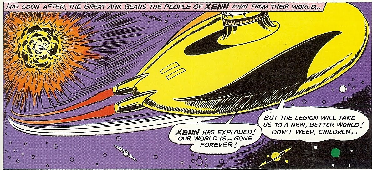
Which, come to think of it, might very well look like the kind of spaceship a young child of the Sixties might have made in an era when creative play was a given and TV didn't provide a mind-numbing baby-sitter for the young all day.
(*1) Mr Hamilton's scripts are fantastically inventive, but they also contain several examples of the kind of impossible scene that causes artists to despair. Here, for example, Mr Forte was required to draw a "dark planet" against the background of space. Oh, well, then, that's easy...
VI: But in all good will and fairness, it should be noted how consistently Mr Forte was asked to draw scenes which would have defeated the design sense and pen'n'ink chops of a far more celebrated superstar artist. It's futile to speculate on what effect a month-upon-month grind of trying to depict never-to-be-used again scenes of frightening complexity might have upon an artists, but who knows how Mr Forte's reaction on seeing panel descriptions such as that for the scene below might have impacted upon his ambition and style. For example, here we have the Legion Of Substitute Heroes flying away from a building quite literally bursting at the scenes because of a host of rapidly-growing plant creatures are causing it to explode outwards, and it's impossible not to laugh outloud at the apparent impossibility of depicting the scene while applauding what Mr Forte achieved. Yes, the scene has all his usual "defusers", the impassive Subs flying in a counter-intuitive direction away from what will be " ... a tremendous population explosion", but it's still to my mind a difficult job done well and truly weirdly. There's even a hint of a most-un-Forteian menace in the tiny zombie-like pod-creatures which have made it out of the green house.
 Those of you already familiar with Mr Forte's work will be able to list dozens of these "impossible" scenes which litter Mr Hamilton's imaginative if artist-challenging scripts. The domed city of ill people constantly following the sun on its planet-girdling rail tracks. The long alleyway of carved asteroids hanging far out in space. The energy blast trying to destroy the attacking black suns. It's a shock that Mr Forte made anything at all of these demands, let alone the often magical pages that he did. Whatever we consider about the quality of his work, the weight of the demands being made upon him was considerable, and yet, there's no apparent sign of a weary artist hacking out the pages beyond in small part the occasional sequence of shark-finned space arks. The work never loses its care and detail, and indeed its affable effect, even when depicting a machine designed to store and then project all the energy in the universe outwards in order to destroy an incoming swarm of black suns.
Next time: our final John Forte blog, in which a few of his most strange and lovely panels will be presented, as well as a challenge for you to nominate those you've found most splendid, or, indeed, the most ridiculous, or both! And let's work up a interblognet campaign to get the next Grant Morrison mega-epic drawn in Mr Forte's style, shall we, because that really would surely bring the DC Universe to sentient self-awareness, as well as making my day!

PS: OK. This is camp.
.


{ 0 nhận xét... read them below or add one }
Đăng nhận xét