"Please Forgive Me For Materializing You ." John Forte & The Legion Of Superheroes part 5 of 5

Người đăng: Unknown on Chủ Nhật, 27 tháng 6, 2010


I. Anybody can produce art that is strange. What's most interesting about John Forte's work is that it is by its very nature strange. "Strange", where Mr Forte's art is concerned, occurs everywhere and all the time; it's not the result of an attempt to shock, or of gross incompetence, or an ignorance of a less-quirky tradition of comic-book story-telling. It's an intrinsic strangeness that exists even when the skies are blue and the teenage superheroes are - sort-of -smiling, just as much as it does on alien worlds populated solely by the statues of long-extinct mysterious creatures. It is, if you like, an honest strangeness, a constant and consistent effect of the choices Mr Forte made job-in, day-out. And as we've been discussing for a while now, the strangeness is generated by a wide variety of design elements and pen'n'ink achievements all working together to produce a world quite individual to John Forte's art. Where other comic books of the period, such as the thin gruel served out by the Batman stories from the Bob Kane school, can now be seen as the product of creators who were cutting corners and underestimating the potential of the stories they were churning out, Mr Forte was regularly turning in complex and yet charming pages of a fairy-story 30th century which deserve a great deal more respect and attention than they've so far received.

At the conclusion below of this final look at Mr Forte's LSH career, I'll put forward a checklist of techniques used by him which could still be adapted and applied to achieve a distinctive and useful sense of "normal oddness", but before then, I'd like to briefly discuss just a few of my favourite examples of his work. (I was intending to present far more than just the panels I talk about below, but I soon realised that I was behaving not unlike the bloke who insists on playing no other records other than his own favourites at the party. It seemed, on reflection, more appropriate, and more respectful of Mr Forte's work, to present and discuss just a few pieces. Then, should anyone ever be in some small way nudged towards considering Mr Forte's Legion work - should they not have already been familiar with it themselves, of course - there'd remain even more hidden gems for them to discover for themselves.)

II. John Forte's work always contained the capacity to convey a peculiar and touching sense of mournfulness. Here his skill at creating quite alien races from Earthly templates quite outside of the usual comic book tradition, combined with his affable style, has produced these doleful statues of an "all-dead" alien race. Mr Hamilton's script has Cosmic Boy describe these effigies as "weird monuments", but I doubt he could ever have foreseen quite how distinctly odd and yet endearing these statues would appear once Mr Forte had got to work on the matter.

The panel creates a sense of stillness and loss through the application of many of the inertia-causing techniques of Mr Forte's that we've been discussing. The panel is again divided in thirds, with each third containing two of the Legionnaires as they stand in a wide semi-circle at the front and bottom of the frame. The focus of the gazes of the young superheroes are fixed on the distant statues far away at the top-centre of the panel, giving an impression that the Legion has been placed in a huge alien graveyard of sorts, and one too substantial to explore with any ease. (It's an impression reinforced by the gaze of the large memorial figure at the right-hand side of the panel, which turns our attention back again to the scene just as our eye is ready to move on to the next panel.) The passive, still postures of the Legionnaires similarly give the reader the sense that this is a planet where the human scale, and human effort, are entirely unimportant. And if the somewhat strange perspective which afflicts the "strange abandoned building" to the top-right of the scene is by now a familiar matter in a John Forte scene, it also carries with it a feeling that this is an environment where odd things are happening, where even old empty buildings don't quite obey the everyday rules of ordinary life.

Most touching to me are the individual qualities of the memorials. The fourth statue from the right, for example, seems to have a serpent of sorts wrapped around it, while his arms have been lost with time. It's hard not to want to speculate about who the race depicted in these statues were, and what were their myths and symbols, and what was the tale of the turtle-lizard who came complete with a serpent wrapped around his belly?

And why did they all disappear?

These enigmas mean that the panel retains its power to move despite those rinky-dink space-boats in the foreground that the Legionnaires have apparently used to land on this planet of the giant civilised turtle-lizards, which says a very great deal considering how utterly unimpressive those sadly typical examples of John Forte's tech-designs are.


The work of Mr Hamilton and Mr Forte regularly feature such examples of dead cultures memorialised by some great markers of their lost makers. The city dwarfed by the cloud-high robots, to take one such scene which actually resonates better in the memory than it does on the page, and the scene above, where another race of aquatically-inspired aliens survives only in the form, once again, of monumental statues. It's a haunting panel in itself, set up by Hamilton's word-pictures - "... built by an inhuman race ages ago, and illuminated by perpetual radium lights .... " - and again our impassive Legionnaires serve as blank slates for us to project our own responses of awe and loss onto them. It is, I believe, a touch too crowded a composition to carry the same measure of despair that the first example above does, for the Substitute Heroes stand so close together that they seem to some greater degree protected from the world around them than the Legionnaires were. But it's still a quietly haunting piece.

No other superhero artist that I can think of regularly left so much space at the far right-hand edge of his longer, larger panels. It's a choice which often leaves his characters hemmed in far away from the promise of escaping into the next stages of the story. Here two of our heroes step rather gingerly through a "world devastated by atomic warfare", and nothing as much marks the loss and fear in the scene as Mr Forte's characteristic stillness and the sense of deathly quiet. A Gil Kane or a Jack Kirby would choose to show the scale of the devastation, illustrating the immense force of the "atomic" weapons which had been used. But Mr Forte simply shows us the world empty of anything that a human being might think fondly of while presenting the ruined city as a simple fact rather than as an means of extracting any excess of fear from the reader. There's a space here between how these ruins of atomic warfare are depicted and our knowledge of what caused that devastation, and that makes the whole piece all the more subtly upsetting; we can't escape into the awe-inspiring thrills of any Kirbyesque depiction of an atomic holocaust, and so we have to accept the fact of the planet's end rather than the spectatcular cause of it. And so the scene is much closer to the quiet fortitude and certainty of extinction that marks "On The Beach" rather than the chest-thumping histrionics of the last scene of the "Planet Of The Apes". In essence, the focus is on the terrible consequences of the bomb rather than the beguiling power of it, and it's all the more scary for it. This is a painfully empty, static world, even for Mr Forte's work. (Two of "thirds" here are empty of any figures or action at all, although the vertically integrating effect of the two skyscrapers in the centre of the panel still divides the space without a Legionnaire in it into two.) And our typically undemonstrative heroes fit perfectly with such a reading. The destruction is so complete that would be futile, even hubristic, for them to respond in any other way than keeping quiet and moving on.

III. From the end of the world to something considerably more enchanting, the panel above illustrates how brilliant Mr Forte was at depicting children, just as he was at projecting a child's view of the world. (I wonder how many contemporary artists could produce something as simultaneously touching and amusing as the above.) A panel as deceptively straightforward as this needs little explanation after all we've discussed, though again it's worthwhile to point how the far right of the panel beyond Dream Girl is quite empty again. With that apparently evil grown woman standing menacingly and confidently between the kids and the progression of the story, we're being told that she's standing between them and rescue, and that's she's powerful enough to bar their escape past her. That empty space is a mental mud-trap, telling the reader that the story's progression breaks down there; it's a clever way of getting the reader to worry how our super-tots will ever manage to return to the sober pinacle of LSH teenagerdom.


IV. So many of John Forte's strengths and apparent weaknesses are present in this final example that it's all I can do to not set a quick quiz here. (I can't resist; "How many of Mr Forte's usual array of techniques are present in this panel, and what effect do they have in combination with each other? 25 marks.") And yet here the work contains a few small innovations of the formulae which result in what for me is his most enjoyable single panel of his entire tenure on the LSH. Once again the reader's attention appear's to be divided into three sections, namely the Legionnaires to the left, the city to the right, and then the smaller figures being thrown through the sky above. It presents a strange challenge of reading; the word balloon at top right demands we first focus on Saturn Girl, whose orders galvanise Lightning Lad and Sun Boy into project their individual powers. Lightning Lad, being the dominant figure in the panel, then throws our attention off to the right, in the normal direction of reading for the Western eye, where his energy bolts flash in front of the hostile city. And then, wonderfully, our eye travels upwards again, to where the three tiny figures, representing the three most mighty Legionnaires, are being blown before the storm. I've never seen such a panel construction before! Where another artist might have tried to present this scene as a single event, with the three wind-blown and tumbling figures appearing in the background of the main scene, Mr Forte, as is his want, hives Mon-El, Ultra Boy and Superboy off into their own part of the panel and uses them to point the reader forwards to the next no-doubt exciting section of this story. In such a way, the panel becomes absolutely full of action and excitement. The power of the Legionnaires in the foreground is emphasised, the force of the storm is accentuated, and the lucky reader gets to dwell in a scene which is untypically both exciting and exacting to read. (A child's eye could focus on this scene for a good long while.) Even the typical Forteian stoicism of his Legionnaires becomes unquestionably a sign of determination rather than boredom or insouciance.

To my mind, it's a small triumph of design and skill, and a good point to break off this attempt to engage with Mr Forte's work. For if there's anybody who can't see a modest and yet considerable virtue in the above panel, well; no amount of extra words on top of all those I've invested above will help my case.

Huzzah! for Mr Forte! Three cheers for his splendidly individual, odd, and engaging art work!

V. So, in some alternative universe, where I've quite undeservedly lucked Jack-Black-like into a job at a prestigious academy training the comic book artists of the future, one of the year's major homeworks will be to apply the oddness-creating techniques of Mr Forte to a page full of superhero action, as well as perhaps a single horizontal panel of a extinct race and the monuments to them on an Ozymandias-evoking planet. I'd be sure, however, to make sure the students had a list such as the following, so they could remember how to mix and max from Mr Forte's considerable repertoire of strangeness-inspiring tricks;
  • create your human characters from the realistic tradition, using considerable detail as long as it doesn't create too substantial a sense of individual difference, emotion or action.
  • produce stiff, largely-impassive and similar figures differentiated by colourful and distinctive costumes. (If you must reach for sophistication, focus on individual hairstyles and height.)
  • only show emotion when it is absolutely demanded by the script. Don't dwell on it. When it's over, it's over, and it should be over in a few panels time at most!
  • juxtapose these blank-slate but realistic characters against backgrounds which contain naive elements, especially where perspective is concerned
  • and skewed perspective should be used to inform readers that what looks like an standard representation of a comic book world is something odder entirely
  • never layer a scene with different events occurring at the same time without breaking up the action according to Forte's rule of thirds
  • remember to slow down time for the reader by turning their attention away from the "escape" point of the panel's right-hand edge, and wherever useful, have as your eye-focusing vanishing point a scene of emotionally-unintense importance near the top-middle of the page.
  • don't be frightened to increase the reader's sense that escape from the moment shown in the panel is impossible by leaving the right-hand third of the panel empty, or blocked off by a dominant figure, or containing a face looking to the left.
  • don't show a character doing something if you can show other characters watching them doing something instead.
  • avoid focusing the reader's eyes on scenes which are unnecessary upsetting or exciting. If that's not possible, have stoical emotional-control panel-front and choose the moment just before or just after the most powerful view to illustrate.
  • If one super-powered character is using their powers, try to have them all doing so.
  • make sure your panel layouts are predictable and traditional: 6 panels in two-panel vertical rows, each occupying a third of a page, with a long horizontal panel four or five times a tale.
  • concentrate on wide and mid shots. Remember that focusing on a large emoting face, unless it's the Emperor Nero, is only going to end in an unnecessary emotion of some kind.
  • When designing technology, don't care about realism. When attending to xenobiology, draw extravagantly from the open-house mix'n'match options offered by Terran lifeforms.
  • Remember that sex and violence are dangerous matters which your audience should be protected from.
  • When in doubt, ask yourself two questions: 1 - what would a young child see?, and 2 - If it doesn't look like it's real, does it at least look like it's engagingly strange?
Now, class, try showing the war between the Green Lantern Corp and Sinestro's army of evil-doers using those rules. All work must be in by Friday, and there will be no extensions.

VI: We humans have a terrible tendency to regard anything which doesn't survive as inferior, as if the shark and the crocodile were markers of excellence, and the dodo and the quagga weak and irrelevant accidents of biology practically begging to wiped from the fact of the environment. But not everything which survives is beautiful or useful, or even morally defensible. (Of course, that which survives is mostly just the most deadly competitor on the field of play.) Jon Forte's world isn't any less beautiful and beguiling because he didn't leave a school of his style behind him, and it contains, as I hope you'd agree, lost and apparently self-contradictory secrets which could well do with being unearthed and put to use on occasion today.

And it's worth remembering that even those things which appear to have been entirely lost have a habit of turning up in unexpected places. Sometimes we find a coelacanth being sold in a South African fish-market hundreds of thousands of years after it was supposed have been wiped from existence. Occasionally, the unexpected survives so far out of sight that it's hard to believe it's still there, but as with Paabo's discovery of Neanderthal DNA in some modern humans genetic code, there's always the hope that what was thought lost might be in some small way quietly influencing the future. And if some of us can perhaps have shadows of gentle, flower-gathering, grave-maintaining Neanderthal dreams at night, then I'd quite like my John Forte moments too.

For I was wrong about Mr Forte's work. Seven days ago, when I started these pieces on his art, I thought his pages occasionally contained single moments of a unique character through an accidental fusion of craft and chance. In essence, if not in every detail, I was accepting the school of thought that judges his work to be "wrong". And I was wrong. Though I've focused here just on his large horizontal panels, I can now see there's a strange, effective and counter-intuitive beauty running through much of his LSH art. I stared at John Forte's work, if you like, and it stared back, and you know what? It really did make me happy.


Please accept an open invitation to offer up a word or two of your own favourite John Forte panels, horizontal or not, in the comments here. Although I started off these pieces on Mr Forte by noting how little favour he's received from professionals of a later vintage, I'm aware that I'm hardly the only John Forte-booster on the interblognetweb. "The Comics Treadmill", for example, ran a whole string of pieces full of a warm appreciation of Mr Forte's work a few years ago. So, even if it's a few months or even years ahead, I love to hear what other Forteian watchers have thought.


Thank you for everyone who's dropped in to read a line or two in one or more of these pieces on Mr Forte. I have no idea what's coming next on TooBusyThinkingAboutMyComics, beyond a suspicion it may concern "The Authority" during that titles' pomp, but whatever, it will involve thinking and comics, I promise you, so I hope I may see you here again. I wish you a splendid day!

.
More about →

Review: Flash: Rebirth hardcover/paperback (DC Comics)

Người đăng: Unknown on Thứ Sáu, 25 tháng 6, 2010

One thing about a Rebirth is that when you finish it, invariably you're left with a handful of easily encapsulatable nuggets that help to sum up the newly reborn character.

One of these after Flash: Rebirth is this: the Silver Age Flash Barry Allen is one of the few fellow heroes that Batman genuinely likes. The significance of this, of course, is that if we understood nothing else after Green Lantern: Rebirth, it was that Batman didn't like Hal Jordan. But Batman likes Barry and Barry likes Hal, and all of the sudden fans know exactly where Barry fits in the DC Comics pantheon -- even if you were thirteen when Barry died and never really experienced him inside the DC Universe.

Someone who was thirteen when Barry Allen died, by the way, is Rebirth writer and newly minted DC Comics Chief Creative Officer Geoff Johns. Sure, I recognize there's back issues, and Johns is undoubtedly familiar with the entirety of Barry Allen's history by now, but I can't disregard that there was never a time for Johns when Barry was "the" current Flash. Whereas I overall enjoyed reafing Flash: Rebirth, the story distinctly like a modern-era recreation of Barry Allen by someone approaching him second-hand, and not a rejuvenation of the original character.

[Contains spoilers]

Johns likely had first-hand experience with Hal Jordan prior to resurrecting him in Green Lantern: Rebirth, and that story served to present all the cool things about Hal Jordan that had already been there but we never fully realized. Flash: Rebirth makes up a couple of things about Barry Allen that are indeed pretty cool and make one want to follow the character, but they're made up nonetheless and not true to the original source.

For instance, if the most a modern fan knows about Barry Allen is that he had a penchant for bow ties, is considered DC Comics' enduring patron saint (by virtue of his long-standing sacrifice and death in Crisis on Infinite Earths), and otherwise seemed like something of a stiff, Johns turns all of these on their ear. Barry himself confronts his reputation as a saint, repudiating it with a host of "angsty" bad deeds including killing the Reverse Flash and abandoning his friends to live in the future. As for the bow tie, Johns retroactively reveals, Barry didn't even wear one until it was slipped on him last minute and his wife Iris liked them. So, Johns seems to say, not so much a stiff as you might have thought.

All of this is clever, especially Barry's sainthood being within the DC Universe as well as without. But, it's a far cry from Johns re-explaining Green Lantern's yellow weakness in light of new evidence; rather it's more like Identity Crisis re-imagining earlier adventures of the Justice League. What we learn in Flash: Rebirth is that Barry Allen truly is so much of a stiff that Johns needs a villain to alter the time-stream in order to make Barry cooler; that it's not enough for Barry just to be a police scientist and a good Flash, but that he needs some kind of "edge" to appeal to audiences, something I thought comics outgrew in the late 1990s.

Even as Flash: Rebirth heralds the return of Barry Allen, it also apologizes for Barry's lack of coolness, when really no one expected Barry to be all that cool to begin with. In this way, we find in Rebirth that Barry Allen isn't returned so much as the DC Universe now has a new Barry Allen-Prime, so to speak -- but I like this Barry Allen-Prime. Rebirth is heavy in Speed Force double-take, but Johns suggests that the forthcoming Flash series will be more of a police procedural, something that's often suceeded in the DC Universe. Barry will solve cold cases against the backdrop of a corrupt police force -- this has worked for most every CBS police drama (complete with an equally "angsty" murder that Barry witnessed in his childhood) so likely it'll work for Flash, too, and I'm excited.

Not to mention that, even as Johns wrote a dynamic Flash Wally West for a number of years, here Johns surprisingly serves to suck most of the remaining fun out of Wally, leaving Barry as the only viable Flash choice. The best part about writer Mark Waid's recent brief return to Flash was how charmingly cute he made Wally's children; Johns presents them here as absolute brats. Even as Barry is the mentor and Wally the sidekick, Barry ends the series seeming the more youthful of the two. Wally gains a new costume reminiscent of his metallic, white-eyed costume again of the 1990s; whereas this does speak to the era from which Wally is best-known, it makes him look dated and Barry the more "modern" Flash.

Yet, there is plenty for Flash fans to like in this story, though as with Johns' Superboy: The Boy of Steel, some might venture it suffers from too much nostalgia. At the end of Rebirth, the Flash-family status quo is essentially the same as around issue #100 of Mark Waid's Flash run, with Jesse Quick back in the Flash fold and Max Mercury resurrected. This latter item is one of the few great surprises of the book, and as happy as I am to see Max, it feels like something of a regression for the Kid Flash character to have his teacher looking over his shoulder again.

The book's other great cameos are of Wally's villains Savitar and Lady Flash; again, I like these characters and I'm glad to see them, but they've each been out of comics for fifteen years, such that Rebirth's intended audience does seem to be fans who've followed the Flash that long, and not necessarily ones who might've joined the DC Universe more recently. In fact, a good 99% of the knowledge you need for Flash: Rebirth comes from the one story where Savitar appeared, Dead Heat -- now, that's a great Flash story, but it makes Flash: Rebirth feel more insular whereas Green Lantern: Rebirth was more expansive.

Early in Flash: Rebirth, the Golden Age Flash Jay Garrick explains how Barry Allen actually inspired him to become a hero again after Jay's initial retirement. Johns is being cute here, too; this is a not-so-subtle reference to the Barry Allen character heralding the Silver Age of comic books in 1950s, which itself helped return the Golden Age heroes to popularity. As such, Johns posits Barry Allen as the DC Universe's preeminent Flash (Barry created the Speed Force, we learn, and gifted every speedster past or present with their super-speed [though completely by accident]) and perhaps even the DC Universe's preeminent superhero (I, for one, like that accolade to go to Superman, but what can you do?).

The irony of the story, ultimately, is that even as Johns takes great pains to suggest that Barry isn't as perfect and unrelatable as we all thought he was, Johns also offers a dozen reasons why Barry is the greatest superhero who ever lived, not to mention having created a multi-dimensional cosmic force that apparently contains the answer to every question ever asked in the entire universe ever. It's a lot to live up to, and I'd venture Flash: Rebirth might've done well to have reigned itself in just a bit. If one detriment of Barry Allen the first time around was too much perfection verging on sainthood, Geoff Johns toes a dangerous line this second time. I'll be watching to see what happens to Barry Allen next in the DC Universe, but if the skies turn red again, he might just want to watch out.

[Contains full and variant covers, introduction, original proposal by Geoff Johns, Ethan Van Skiever sketchbook]

I hope you've enjoyed our Flash week at Collected Editions. Don't miss this week's other Flash reviews, Flash: The Return of Barry Allen, Flash: Emergency Stop, Flash: The Human Race, Flash: The Wild Wests. Tip of the Flash hat, of course, to Kelson Vibber of the Flash-centered Speed Force blog for his guest reviews this week, and also to everyone who posted and re-tweeted about the Collected Editions Flash Week -- thank you!
More about →

Người đăng: Unknown


Number 760


Let's see Batman do this!


Madam Fatal is one of the most unique concepts in comics, especially 1940, when these two tales originally appeared. Madam Fatal was actually a man, a wealthy "retired actor" who spent his time dressed as a woman, chasing down the man who killed his wife and kidnapped his daughter. There's the crossdressing element that makes it seem titillating today. Or maybe not. Madam Fatal is an old "lady" after all. Despite its originality Madam Fatal as a feature didn't last long. There were a lot of comic books to fill and a lot of ideas for heroes that didn't work out, and Madam Fatal was one of them.

Underground cartoonist Kim Deitch did a hilarious take on Madam Fatal in Corn Fed Comics #1...but it's pornographic and I can't show it, much as I'd like to.

The stories are from Crack Comics #1 and #3, respectively, 1940, drawn by Art Pinajian.


More about →

Everyone Is Important, Everything Should Be Shown: The Penultimate "John Forte's Legion Of Superheroes"

Người đăng: Unknown on Thứ Năm, 24 tháng 6, 2010

1. A Blogger Posts A Warning To His Readers

I do feel that I ought to warn anybody who's found it in their heart to persevere with these pieces on John Forte's Legion Of Superheroes that they'll find me writing below of how I've become convinced that Mr Forte would have been the perfect artist for Grant Morrison's "Final Crisis".

It strikes me that that's such an apparently ridiculous idea, and one which I'd certainly never have considered before writing these past few pieces, that I may have quite lost whatever sense of perspective I previously owned. (It's obviously gone wherever Mr Forte's sense of perspective had travelled before it.) Be warned, gentle reader, this may the case of the bridge too far beyond the bridge too far.


And now; concluding our look at some of the strangeness-causing elements of Mr Forte's work;

II.
Like some strange translation of the principles of Krautrock to the comic book page, John Forte's work gains much of its strange power through providing subtle variations within a framework of metronomic repetition. The same page layouts occur time after time, and unlike, for example, the periodic experiments that Curt Swan carried out with, for example, long vertical frames occupying two-thirds of a pages' left hand side while horizontal panels are stacked to the right, Mr Forte kept to a default page design of three equal rows containing two panels each. Four or five times over the length of a leading feature, Mr Forte would break this pattern by creating a single horizontal panel occupying an entire row, and as I've argued before, these longer, narrow pieces often contain his very best work. The effect is, over a run of pages, quite hypnotic, accentuated by his preference for front-facing wide to mid-shots and his reluctance to allow any figure to dominate the scene he's depicting. If the purpose of Jack Kirby's work was always to involve the reader by engaging their attention at the most intense moment of the action at hand, then Mr Forte's work was concerned with the opposite process. As can be seen by the panel below, the reader was far less thrown into the events on display so much as forced to view them through an observing character's eyes, placing us in the position of watching a character watching another character doing something.

Here, Brainaic 5 engages in a dual of multi-dimensional chess while - I believe - Pete Ross and Jimmy Olsen ignore their different decades of origin to look on. As a result, we're not vigorously engaged with Brainaic 5, who's hardly locked into the most visually thrilling dual in the first place, but rather focused on the two teenagers watching him. This has the effect of pushing the reader out of the action, making us feel as if we're far away from events, as if we're wearing our distance lenses rather than having our glasses for close reading at hand. Combined with those other factors we've already discussed, from his own unique rule of "thirds" to the extremely strange perspective to the "backwards" direction of the action, it's as if Mr Forte has quietly dosed us with a selection of visual tranquillisers to prevent us becoming too excited. And yet, as with most mild dose of tranquillisers, there's that unexpected focus, that illusionary sense of precision of thought. By distancing the reader from the meaning of the panel, Mr Forte manages to lend his work an absurd kind of intensity. It's ridiculous, but it's also true.

III. Though he does on occasion execute a comparatively daring mid-shot, or even a rare and almost perversely dynamic medium close shot with an attention-dominating figure in the foreground, such as shown above, Mr Forte is most comfortable stringing his characters across his panels in more or less straight lines while allowing no single figure to entirely dominate the attention. This again stands in direct opposition to Jack Kirby's work, because the refusal to centre on one figure or one example of action tends to diffuse the impact of whatever the panel is supposed to be depicting, creating multiple focuses vying for the reader's attention. This diffusion might have been avoided if, for example, Mr Forte had placed elements of vertical integration in the background of his work, strong organising top-to-bottom elements which might dominate the sense of his frames and pin his characters together in the same scene, with a common relationship to each other. Instead, characters seem to a degree to occupy quite separate and disconnected places, and even planes. Every character carries a similar weight of importance to every other one, and combined with a tendency to show full-body shots of figures dominated by the environment they're in, this gives the impression that nothing of real dramatic importance is happening here - even when the likes of flames are shooting out of Sun Boy's hands - and that we ought to move on. It's such an odd effect to create, especially when it is considered that Mr Forte obviously felt it was incumbent upon him to show most if not all of the Legion showing off their powers if just one or two of them needed to do so. (In such a way can his direct line to a child's mind be established. It's so easy to imagine a child describing the events occurring within individual panels of Mr Forte's LSH work: "And then Bouncing Boy was bouncing, and Sun Boy's hands were on fire, and Shrinking Violet was shrinking, and Chameleon Boy was changing shape .... ") This strange lack of focus can be seen in the shot of the Legion Of Substitute Heroes at the top of this page, and below, in what was actually one of Mr Forte's more dramatic panels, where each Legionnaire has their moment in the sun while Bouncing Boy flies all over the place in what seems like a deliberate attempt to prevent the eye coming to rest anywhere in the scene at all;


However, being as pleasantly literal-minded as he was, Mr Forte obviously felt compelled to give Colossal Boy far more panel-space than any other character when Gim Allen had grown into his giant-sized form. It was as if Mr Forte's habits of drawing a particular kind of landscape and placing his characters into it in a particular way couldn't be changed to incorporate this huge superhero. (Or perhaps he felt obliged to keep everything to his original scale so he could help his younger readers grasp what "colossal" meant.) And it's often in those panels, which feature the Legion's own giant attaining the size of a mid-town department store, that carry the most traditional sense of superhero power. Suddenly, as can be seen below, Mr Forte's panels burst into life, with the kinetic and muscular presence of Colossal Boy co-existing with the familiar and static elements of the more typical Forteian action/no-action scene.

And while we'll come to the uniquely testing demands of Mr Hamilton's scripts upon John Forte's talents in just a few panels, perhaps here we might pause in a foretaste of that and just delight in the sight of a giant head sculpted out of an asteroid slamming into Colossal Boy while the Legionnaire in turn gently shoves a tiny Light Lass away to safely. No fire-storm trail through the atmosphere, no sonic booms, no miles-wide pit of glass, no mushroom cloud; no, our favourite really-big Legionnaire is merely knocked off his feet, rib-cage intact if slightly winded. And he saved that inattentive Light Lass too, or perhaps he just saw the asteroid-head first, because he was, er, closer to it than she was as it flew towards them.

IV. In his "Understanding Comics", Scott McCloud speculates on the effect of placing characters drawn with very simple and "cartoon" facial features into panels marked by complex, realistic backgrounds. The relatively blank faces, he argues, allows the reader to identify with the actors on the page, and the detailed and apparently recognisable scene-sets create a sense of "realism". Well, with John Forte's work, his impassive characters certainly permit the reader to associate themselves with whoever is on show. There's no substantial difference between any of his male leads, even given Chameleon Boy's antennae and Brainiac 5's green skin, so there's no individual particularity preventing the reader from associating with this character or that. (Indeed, it might be argued that Mr Forte's incredibly similar looking characters existed in order to permit young readers to take the part of this Legionnaire or that without having to be concerned with any differences of character or appearance.) However, the backgrounds of Mr Forte's work are far from naturalistic, or detailed in any typical sense. In fact, they tend so strongly towards the naive that it's a rare adolescent, let alone an adult, who could take them seriously. (Young children, of course, would have no trouble at all in doing so.) And this means that panels such as that below seem to have been wired up quite contrary to the kind of formal rules Mr McCloud is engaged in trying to decipher. The human characters in the foreground are both cartoon-like in their expressions and similarity while also belonging to the "realistic" tradition of four-colour art. (It's funny, isn't it, that the "Proteans" to the right third of the panel lack any faces and yet are actually more expressive than the Legion are: the blobs have the character of a surly mob, the humans the qualities of scissor-cut cardboard figures for a child's theatre play-set.) And then as if there weren't enough mixed signals being fired off by the foreground, there's then the juxtaposition between the partially-realistic Legionnaires and the utterly absurd and naive background. For a static scene, the art transmits on so many frequencies of meaning that it's like watching the visual equivalent of static on a late-night medium-band radio, through which the signals of several indistinct stations weave in and out of focus, often over each other's programmes.

The aesthetic appeal of John Forte's work lies in part for me in the very fact that his work pins the modern, adult reader's mind back with so many contradictory, mixed messages. The aesthetic of his work is almost, the reader can't help but suspect, a deliberate attempt to enchant the child's mind while at the same time causing a hundred "huhs?" to spark up in an adult reader. Young children, of course, are not simply adults with less mental processing power: they perceive the world in quite different and distinct ways. To a five year old, the above is a scene of wonder. I very much doubt the Legion's originally intended audience would be concerned with Mr Forte's utter indifference to how unconvincing the technology and buildings are. He's focused on the meaning of the background to the story; it's a sketch of the fact that folks underground need light and shelter. (They may not need perspective, but that's never been mentioned in a hierarchy of needs, has it?) And the foreground contains all the golly-gee-whiz material, the colourful and comfortingly interchangeable heroes, the strange aliens and so on. But to a mind operating at a more cognitively adult stage, this panel alone appears to be a storyboard for a classroom lesson on the dangers of post-modern borrowings lacking an integrating ethos. Surely none of all of this belongs together; the rules change according to where the eye travels and which objects the mind combines to create meaning. It's a panel which constantly undermines its own appeal, and yet because of that, I've come to value it very highly. This isn't "camp": it's nothing to do with kitsch and irony. It has its own logic and beauty and it achieves its affect because of Mr Forte's skills and choices rather than because of any modern-age tongue-in-check engagement with it.

In a comic-book world obsessed with surface, with the appearance of reality rather than its depth and disturbances, there's always the danger that any depiction of the superhero that isn't "realistic" will be relegated to camp-fodder, which is of the course merely an adult expression of the playground's tendency to cruelly belittle anything which doesn't immediately conform to the moronic everyday standards of the "familiar", "acceptable" and "normal".


No, this panel above is nothing else than an oddness-experience machine! Plug into it and it shifts the whole world just that tiny fraction of a degree away from the standard mode. And so can I be the only person who thinks Grant Morrison needs a Forteian artist for his next project? I may well be mocked for this, but imagine, to take but one example, "Final Crisis" executed in a faithfully imaginative and respect take on John Forte's style. That would have been quite wonderful, and far stranger and yet considerably more understandable than the final mish-mash of a product was.

V. I will readily concede, however, that John Forte's lack of interest in technology does still in places throw me quite out of page, panel and story. For while there's surely no doubt that Mr Forte's LSH is a children's fairy story presented under a sugar coating of supposedly 30th century technology, that trick only works well until the tech of the distant future needs to be shown centre-stage. In the panel below, for example, we see a fleet of what we're told are "sinister astronauts" approaching a dark planet. (*1) Even ignoring the fact that our sinister astronauts are actually racing right past the planet, soon to hurtle right through the right-hand border of the panel without ever getting close to their destination deeper in the plane of the scene, it can't be ignored that the lack of leg-space for the evil Roxxas's men poses an immediate to the verisimilitude of the tale. (Mr Forte consistently present future-tech which ignores the need of the human knee to bend on occasion. Grud only knows how those space-pirates' circulation survived with their legs flat against the floor of their attack craft for a few hundred thousand miles or so.) In truth, these craft hardly seem convincing enough to pass muster as a child's training dinghy, and Roxxas himself actually seems to be leaning forwards in an attempt to coax more speed from his deadly vehicle. Perhaps he shakes his steering wheel with fury as his speed maxs out without topping 11 on his speed metre.


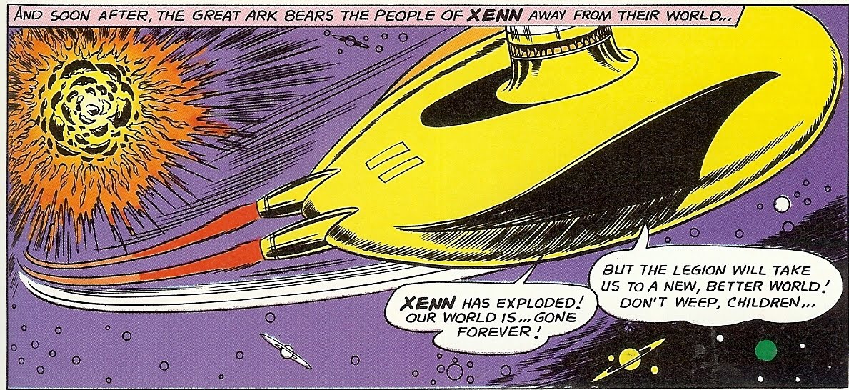
In his introduction of the LSH Archives volume 2, Harry Broertjes suggests that we charitably consider that Mr Forte was drawing his inspiration from the era of Flash Gordan, stating that he couldn't draw from the familiar iconography of Star Trek because the adventure of Kirk and crew hadn't actually begun yet. But this is disingenuous, because it relies on there having been no innovations in the depiction of futuristic technology since the mid-1930s, and that's patently not so. It's not that the choice was Flash or Kirk, but that there was a whole world of science-fiction material for Mr Forte to adapt to his purposes. Remarkably, for an artist who had previously made a living from science-fiction illustration, Mr Forte seems in his LSH stories to have avoided being influenced by any work in the science fiction tradition for almost 30 years before. Even a nodding acquaintance with the EC artists of the Fifties, for example, might have widened the source material he could adapt to avoid the anachronisms of his space tech. Perhaps he considered that the world of the future was so fantastic that it didn't need to be depicted in a way which followed any traditions or reflected even the science of his own time, but the strange thing about the fantastic is that it relies on the mundane to ground it. An example of how disconcertingly nonsensical his spaceships could seem stands below, where Mr Forte's design is not only outstandingly ill-thought through, but it commits the cardinal sin of presenting a spaceship which few children might daydream of flying. Shock, awe, perspective: all of those can be ignored if the result is magical, but the Great Space Ark of the people of the doomed planet of Xenn looks like nothing so much as a couple of rubber sharks fins stuck backwards on a frisbie with a light-bulb socket placed on top.


Which, come to think of it, might very well look like the kind of spaceship a young child of the Sixties might have made in an era when creative play was a given and TV didn't provide a mind-numbing baby-sitter for the young all day.

(*1) Mr Hamilton's scripts are fantastically inventive, but they also contain several examples of the kind of impossible scene that causes artists to despair. Here, for example, Mr Forte was required to draw a "dark planet" against the background of space. Oh, well, then, that's easy...

VI: But in all good will and fairness, it should be noted how consistently Mr Forte was asked to draw scenes which would have defeated the design sense and pen'n'ink chops of a far more celebrated superstar artist. It's futile to speculate on what effect a month-upon-month grind of trying to depict never-to-be-used again scenes of frightening complexity might have upon an artists, but who knows how Mr Forte's reaction on seeing panel descriptions such as that for the scene below might have impacted upon his ambition and style. For example, here we have the Legion Of Substitute Heroes flying away from a building quite literally bursting at the scenes because of a host of rapidly-growing plant creatures are causing it to explode outwards, and it's impossible not to laugh outloud at the apparent impossibility of depicting the scene while applauding what Mr Forte achieved. Yes, the scene has all his usual "defusers", the impassive Subs flying in a counter-intuitive direction away from what will be " ... a tremendous population explosion", but it's still to my mind a difficult job done well and truly weirdly. There's even a hint of a most-un-Forteian menace in the tiny zombie-like pod-creatures which have made it out of the green house.

Those of you already familiar with Mr Forte's work will be able to list dozens of these "impossible" scenes which litter Mr Hamilton's imaginative if artist-challenging scripts. The domed city of ill people constantly following the sun on its planet-girdling rail tracks. The long alleyway of carved asteroids hanging far out in space. The energy blast trying to destroy the attacking black suns. It's a shock that Mr Forte made anything at all of these demands, let alone the often magical pages that he did. Whatever we consider about the quality of his work, the weight of the demands being made upon him was considerable, and yet, there's no apparent sign of a weary artist hacking out the pages beyond in small part the occasional sequence of shark-finned space arks. The work never loses its care and detail, and indeed its affable effect, even when depicting a machine designed to store and then project all the energy in the universe outwards in order to destroy an incoming swarm of black suns.


Next time: our final John Forte blog, in which a few of his most strange and lovely panels will be presented, as well as a challenge for you to nominate those you've found most splendid, or, indeed, the most ridiculous, or both! And let's work up a interblognet campaign to get the next Grant Morrison mega-epic drawn in Mr Forte's style, shall we, because that really would surely bring the DC Universe to sentient self-awareness, as well as making my day!


PS: OK. This is camp.

.
More about →

Review: Flash: The Wild Wests hardcover (DC Comics)

Người đăng: Unknown

Continuing Flash Week at Collected Editions!

Undoubtedly one of the prices of a successful run for a comics writer is that your fan base expects you do to the same every time. Such must certainly be the case for Mark Waid; his Flash: Wild Wests is nothing like The Return of Barry Allen, nor should it be, even though I might have been hoping so. Wild Wests is a fair entry into the genre of superhero family stories, if there is such a thing; but unfortunately, it doesn't really distinguish itself as a Flash story nor rise much above standard superheroics.

Without a doubt, the very best thing about Waid's new foray into Flash is Wally West's children Jai and Iris. Waid ages the twins, but wisely not too old, such that they're rare adorable preteens in a DC Universe mostly populated with smarmy Damian Waynes. That Iris notes she's special because her parents say so, or Jai delights in his mother wearing a funny hat, is just plain cute, and Waid does well mining a "cute" vein that DC doesn't much else see outside Tiny Titans. Even the kids' powers are cute -- Jai bulks up to a tiny muscleman, but has to take a nap after he does so; Iris teases her brother by vibrating through him to steal his breakfast.

Under the cuteness, however, Waid addresses a problem to which many parents can likely, unfortunately, relate: how to let a sick, possibly terminal kid still have a childhood? Wally and Linda (Park) West are exactly the parents that long-time Flash readers would expect -- cool, funny, understanding, and up-for-anything, but with a significant undercurrent of constant worry about their children, who could rapidly age, even to the point of death, at any moment.

Waid does well to let Wally receive some criticism from the Justice League for putting his children in harm's way (not unlike the parents of recently-stranded sixteen-year-old sailor Abby Sunderland). Wally decides in full, after a heart-rending talk with Jai, to let his children face danger if that's what they want; it's a decision that seems obvious on the pages of a comic book, but has proved more controversial in real life, and I appreciated Waid approaching the issue.

The character moments, however, don't make up for a rather lackluster plot involving a very standard alien invasion. The aliens are bad guys all along and end the story as bad guys; as such, there's no nuance to the story, short of the children, beyond the Flash running around and punching things. To make the unfair comparison, Waid's previous Flash stories were so full of Speed Force mythology and cool speed tricks; here, Wally's speed is mostly a weakness in that the aliens make him dehydrated (of all things) faster, and not much of a boon.

Daniel Acuna's art in the first chapters has a fluidity that shows off both the West kids' powers and the aliens well, but later Freddie Williams' pages suffer from lack of detail (no one has eyes, for instance) and awkward poses that keep the story's climax from popping.

In addition, I have to pick at a production level difficulty, too. When these Flash issues came out, they had a backup story about various Flashes visiting the planet Savoth; DC collects those backup stories all together at the end of the book. Only thing is, something that happens in that story is vitally important to understanding the main story's resolution, but reading this book in order, the main story's resolution is unintelligible (out of nowhere, they're on a friendly alien planet) and lacks much of its intended weight.

(Not to mention -- if I can be really picky -- I remain entirely confused about what's meant to have happened to Wally West after Infinite Crisis. Distinctly we saw Wally go into the Speed Force with Bart Allen, Max Mercury, and Barry Allen; Bart himself recalls living on a duplicate Earth with Wally and Barry where they imprisoned Superboy-Prime; but Wild Wests would tell us Wally was never there and on Savoth instead. My hope is that Flash: Rebirth will explain all this, but I'd bet it's just an overlooked story point that'll ultimately just be ignored.)

Little of that is Mark Waid's fault, but ultimately this story doesn't have the gusto of a Flash comeback; I really wonder if the run collected in Flash: The Wild Wests was ever meant to be ongoing, or if it was instead a miniseries-posing-as-series (as, if you believe DC, Flash: Fastest Man Alive was supposed to be). I would read a West family miniseries by Waid, no doubt, but for the content of the main Flash title, this isn't quite it.

[Contains full and variant covers, brief bio page, backup story]

Coming tomorrow, the main event ... the Collected Editions review of Flash: Rebirth. Be here!
More about →

Trade Perspectives: DC Comics/Comixology Digital Comics Announcement

Người đăng: Unknown on Thứ Tư, 23 tháng 6, 2010

I'm interrupting the Collected Editions Flash Week, of course, because today is a momentous day in DC Comics history. I wonder if one day we'll look back on June 23, 2010 (or late evening June 22, 2010, to be technical) as a date like June 1938 when Superman first appeared -- a day after which comics were never the same again.

And, as primarily a DC Comics reader, I'm fiercely proud of any number of aspects of DC's new digital initiative, from the ability to read comics on multiple platforms to their stated intent of using some of the revenue toward local comic book stores, to how close DC played all this to the vest before the announcement. At a time when it seems there's no surprises left in comics, this was a shocker.

That said, for the time being, this new initiative changes my comics reading habits not at all.

Neither Faster Nor More Powerful
I in no way mean to take away from the wonder of DC's announcement. If you're a monthly comics fan with an iPad, and you live far away from or otherwise don't have access to a comic book store, and you don't mind your comics in digital format, this seems like the thing for you. You get your comics on time (Justice League: Generation Lost at least) and at no greater price; I read the Superman #700 preview on the Comixology website (no iPad here, unfortunately) and it's a quite fine, readable interface.

But as a wait-for-trader, today's issue of Justice League: Generation Lost online holds no more value for me than the issue in the stores; I haven't read Blackest Night yet, so I'm not about to pick up Generation Lost. And, even once I've read Blackest Night, there would be no more draw for me to read Generation Lost online than to get it at my local comic book store -- the release date is exactly the same as the physical issue, and the price (on the release date, at least) is exactly the same.

Good for DC, that is, in giving readers more choice in terms of how they want to read their comics -- but without sweetening the deal in relation to the existing sales model, I have no reason to make a switch.

Whose Comics Now?
In addition, whereas I like the Comixology interface, I'm surprised I haven't seen anyone online talking about the digital rights issue yet. Near as I can tell (and feel free to educate me further), you don't receive copies of the comics files yourself, but rather you log in to Comixology to view your comics library. The same questions that apply to digital books apply here: What happens if Comixology (no offense to them) goes out of business? What happens if they lose your account? What happens if you want to replace your iPhone with a Droid -- will you feel locked into the iPhone so as to retain mobile access to your comics collection?

Certainly there's good answers to these questions, and the fact that Comixology and DC already offer iPad, iPhone, and web access is more than other mobile reading paradigms offer. But, the fact that something that's "yours" isn't yours -- especially when considering often-massive comics collections -- gives me initial pause.

Directions for Digital to Go
Again, however, we're just at the beginning of this. I don't see anything necessarily bad about DC's initial digital announcement -- and as a matter of fact, they're doing many things better than other companies -- I just don't see its breakthrough application for me yet. Here's what I'd like to see next from DC's digital comics:
  1. 1. Drop the price point. I know creators have to get paid and I know there's some labor involved in digitizing these comics, but selling digital comics at the same price as the physical issues in the absence of shipping and printing costs doesn't make sense. If I have to pay the same amount, I might as well just get the physical copy.

  2. 2. Expand the backlist. Obviously this is coming, but I'll be far more enthusiastic about all of this when the Batman offerings aren't the first issue of Batman: Year One, already reprinted everywhere, but rather all of Batman: Year Three (or Flash: Hell to Pay, as we were discussing here recently).

  3. 3. Offer a subscription service. I don't necessarily want the digital rights to a full Comixology-held copy of Blackest Night for life, but I wouldn't mind reading the whole series now in advance of the hardcovers, and then enjoying my hardcovers in perpetuity. If DC/Comixology offered a subscriber service where for a flat fee or monthly rate I could read all comics published in the last twelve months, but when they're gone, they're gone; or I could "check out" so many titles at one time but then had to "return" one before I could read another, that would be attractive to me. To some extent, this might be the Netflix approach to DC's digital comics.

  4. 4. Sell series at a discount. We begin to get into the realm of trade paperback collections here -- even if the individual issues of Batman: Hush are discounted at $1.99, I expect a certain reward if I sign on to buy all the issues at once -- even one issue free might be a possibility.

  5. 5. Give new life to old series. Invincible Super-Blog's Chris Sims wondered aloud what would happen if cancelled series Manhunter or Blue Beetle did well in the digital comics format -- might that spell a return for those titles?

  6. 6. Start with the digital. Matter of fact, I think DC should go farther and offer new content starring these fan-favorites -- co-feature-sized Manhunter or Blue Beetle stories, priced at $0.99 (or get all twelve stories for $11) that start at DC Digital and then are collected in trade paperback later on; this is, I believe, essentially the Zuda model. That is, let's not just see DC Digital as a repository for what's also coming out every week, but let's also see DC Digital as a launch pad for series that might not otherwise survive in the monthly market.
(Things are moving fast today! As I'm writing this, I noted that on Comics Alliance, Laura Hudson interviews Jim Lee and addresses some similar items with him. Two salient excerpts:
CA: In terms of pricing, will there be any digital versions of trades – bundled collections of digital comics that sell for less than their price as singles?

JL: Right now we're focusing on the periodical side of things, but obviously we have had many detailed discussions about graphic novels and how those are best served going forward in the digital space and we'll have announcements shortly as we get to them, but our initial release is focused on periodicals, and there's a reason for that. That's as much as I can say about it . . .

CA: Have you given any thought to the possibility of releasing digital-only content, perhaps for critically-acclaimed titles with small but loyal followings like "Manhunter" or "Blue Beetle"?

JL: Not in the short term. Part of our mantra with all this is to make sure it's as additive as possible, so the idea of doing something where you're limiting it to a certain channel doesn't really speak to that strategy. But I would say, never say never. There could be some sort of compelling reason to have it be digital only – some level of interaction only digital could provide that wouldn't be well served by print. But initially, there is no plan to do that. It's really about making it an additive experience and making sure our traditional brick and mortal storefronts are well-served by us promoting and selling more comic books to more people. Ultimately we are building the audience, and that will build an entire marketplace not just for the digital channel but the brick and mortar channel.)
In essence, I'm really excited about DC's digital announcement today -- but I'm more excited about what DC's digital announcements will be tomorrow, and the day after that, and the day after that. Dare I say it?

... Just imagine.
More about →

Review: Flash: The Human Race trade paperback (DC Comics)

Người đăng: Unknown

This week, we're featuring all things Flash at Collected Editions! Here's another guest review from Kelson Vibber of the Flash-centered Speed Force blog and Those Who Ride the Lightning Flash reference site.

Flash: The Human Race covers the second half of the year-long Grant Morrison/Mark Millar run on The Flash from the late 1990s, plus one more short story. This volume rushes even deeper into "mad ideas" territory than the first, with the Flash racing across time and space first against his childhood imaginary friend, and then against death itself.

The Human Race
The Flash is forced to compete in a cosmic footrace, or else the Earth will be destroyed. The concept is simple, but the details are crazy: The racetrack loops across space and time. One obstacle is a collapsing star. Another is running through the last moments of the exploding planet Krypton. And the Flash's opponent -- Krakkl of the radio-based people of Kwyzz -- is Wally West's childhood imaginary friend (who turns out to have been not so imaginary after all).

This book absolutely revels in the kind of crazy stories you can tell when you don't need to worry about a special effects budget.

Despite that, it manages to feel very familiar. Several of the Bronze-Age races between Flash and Superman had them running across space and time. One race was controlled by cosmic gamblers. Krakkl looks vaguely like Sonic the Hedgehog if he were made out of energy (with Kirby Dots, of course). Even the twist is similar to something Morrison himself does just two years later near the end of his JLA run. (Come to think of it, that same twist fits in well with certain elements of Flash: Rebirth.)

The Black Flash
I'm surprised that this wasn't used as the title of the collection, considering that the concept of death for speedsters has had so much more impact. The Black Flash has shown up in Full Throttle, was referenced in Final Crisis, and showed up again in Flash: Rebirth. Radioland? Not so much.

The basic premise: Max Mercury learns that Wally West is about to die, and tries to save him. But death doesn't leave empty-handed, and takes Linda Park instead. Wally is devastated . . . and death isn't satisfied. It begins stalking him in the form of the skeletal Black Flash.

Two things change with The Black Flash: Grant Morrison drops out, leaving Mark Millar flying solo as writer, and Pop Mhan and Chris Ivy take over the art. The writing comes off a bit awkward in some places, while in others it's absolutely dead on. For instance, at one point, Captain Cold is holding the city for ransom in a way that makes absolutely no sense for Captain Cold; Impulse's characterization, however, is absolutely perfect.

The story bounces back and forth between the utterly ridiculous and the devastatingly real. It's at its best in the character beats in the middle chapter. Sure, several Rogues show up, and the third chapter is one long stuck-in-time battle with the Black Flash . . . but Impulse saying, "Wrote you a letter when you blinked," or Wally West trying to explain to Jesse Quick why he can't handle super-heroics anymore in the absence of Linda, or the absolute bleakness of the funeral . . . those are the moments that that stick in my head.

The ending, unfortunately, relies on not one but two of those cool-when-you-read-it ideas that make absolutely no sense if you think about them for more than a half-second.

I remember severely disliking Pop Mhan's art when this first came out, and I still feel it's not a good match for the Flash. People's features are very exaggerated, and everyone seems to be about 9 feet tall. At the same time I have to admit: he does the best rendition of the Black Flash that I've ever seen.

Flash of Two Worlds
The last story in the collection is a short from 1990 in which Grant Morrison tries to adapt the classic "Flash of Two Worlds" into modern continuity. The original story had Barry Allen crossing from one universe to another and meeting Jay Garrick, but Crisis on Infinite Earths had changed things so that Central City and Keystone City were in the same universe, on opposite sides of a river.

The solution: The Thinker, Fiddler and Shade (who had simply gone on a crime spree in the original story) have cut off Keystone City from the rest of the world, and Barry manages to cross through that barrier.

It's told as a mix of standard comic book panels, childish sketches, and narration by an eight-year-old who witnessed part of the event and heard the rest from the Flashes themselves, giving the whole thing a fragmented feel, as if we're not really getting the whole story.

In a way, that's almost better, because like "The Black Flash," the story works better if you don't think about it too much. Sure, the Rip Van Winkle angle works great as a substitute for crossing dimensions, but it opens up questions that DC has never really been sure how to answer. How long was Keystone City kept separate from the world? Months? Years? Decades? Did people age? If they didn't, that's got to make for some awkward families. If they did, imagine all the young children who woke up as adults without actually growing up.

Overall
This is a much more uneven collection than Emergency Stop on creative team alone. Paul Ryan drops out part-way through "The Human Race," to be replaced with Ron Wagner, but their styles are similar enough that it's not too jarring (John Nyberg inking both of them has to help); whereas Pop Mhan's exaggerated style is a huge change, even coming at the beginning of a new story. "Flash of Two Worlds" feels even more out of place, but given how critical it is for the modern Central City/Keystone City dynamic, it's good that the story is available somewhere that today's audience can find it.

On the plus side, the stories of Flash: The Human Race are far from the fill-in tales they could have been. Just as Emergency Stop introduced the Speed Force costume and set up Jakeem Thunder and the modern incarnation of the Thinker, this volume introduced the Black Flash and set up Wally and Linda's engagement . . . a major development which would factor into the next two years of stories when Mark Waid and Brian Augustyn returned to the book.

Tomorrow at Collected Editions, we'll look at the last trade paperback of Wally West's adventures, before the Collected Editions review of Flash: Rebirth on Friday. Don't miss it!
More about →